423 views||Release time: Nov 27, 2025
Your title is the hook. It must be readable from 10–15 feet away. Avoid lengthy, jargon-heavy titles. Instead, try to state your main finding or a provocative question as the title.
Tip: Use a sans-serif font (like Arial or Helvetica) for the title at a size of 72–100 pt.
Don't: Use all caps for the entire title; it is harder to read.
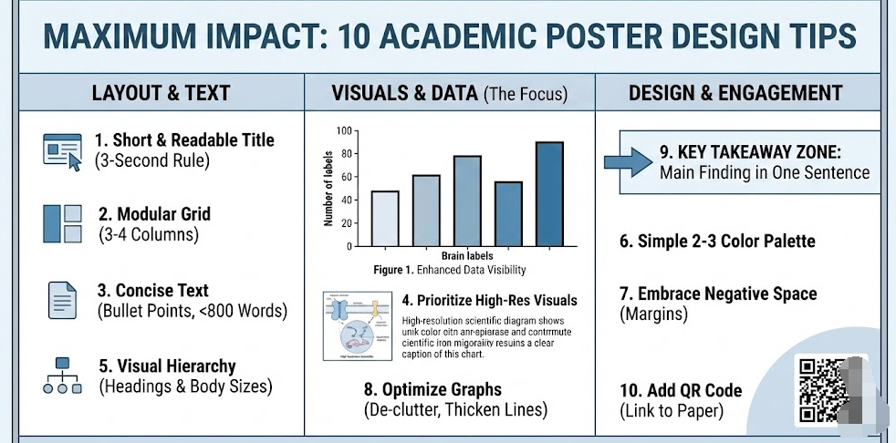
Humans naturally read from top-to-bottom and left-to-right. Organize your content into 3 or 4 distinct columns. This creates a logical flow that guides the viewer’s eye through your Introduction, Methods, Results, and Conclusion without confusion.
A poster is a visual aid for a conversation, not a manuscript. Aim for a total word count of 300–800 words.
Use Bullet Points: Replace paragraphs with bulleted lists wherever possible.
The 20% Rule: Text should take up no more than 20–25% of the poster surface.
Tip: If you have to stand closer than 3 feet to read the text, it is too small or too dense.
Charts, graphs, and diagrams process faster in the brain than text. Make your "Results" section the visual center of the poster.
Resolution Matters: Ensure all images are high-resolution (300 dpi or higher) so they don't look pixelated when printed on a large canvas.
Captions: Every figure needs a standalone caption. A viewer should understand the chart without reading the main body text.
Use font sizes to signal importance. This helps the reader scan the poster quickly.
Title: 85+ pt
Headings: 36–48 pt
Body Text: 24–32 pt (Never go below 24 pt)
Captions: 18–24 pt
Too many colors create visual chaos. Choose a simple color scheme:
Primary Color: Use a neutral background (white, light grey, or a very light muted color).
Accent Color: Use one bold color (like navy blue, maroon, or forest green) for headings, borders, and key data points.
Contrast: Ensure high contrast between text and background (e.g., dark text on light background). Avoid dark backgrounds with white text for the whole poster as it tires the eyes.
White space (empty space) is not wasted space; it is an active design element that prevents clutter. Leave wide margins around the edge of the poster and distinct "breathing room" between columns and sections. This makes the content look approachable rather than overwhelming.
Don't just copy charts from your paper or Excel.
Remove Clutter: Delete gridlines, background shading, and unnecessary legends.
Thicken Lines: Make axis lines and data lines thicker so they are visible from a distance.
Direct Labeling: Instead of a legend box on the side, try to label data lines directly on the graph.
Many successful modern posters (like the "Better Poster" movement) dedicate a specific area—often the center or a sidebar—to a single, plain-English sentence that summarizes the main discovery.
Example: "We identified Protein X as the primary driver of resistance in Drug Y." This ensures that even someone walking by quickly learns something.
Since you cannot fit everything on the poster, bridge the gap to your full research. Include a QR code in the corner that links to:
A PDF of the full paper.
Your contact information/LinkedIn.
Supplementary data or high-res images.